Visualisation/Violinplot
Jump to navigation
Jump to search
Example
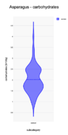
The carbohydrates distribution of products in the category Canned Asparagus are show in plot. 540 products have been used in creating the plot. The carbohydrates values go from 0.3 to above 4.5 g/100g. There seem to be two peaks in the distribution: around 1.7 and 2.5 g/100g. The distribution has a long tail between 3 and 4.5 g/100g. This might indicate an issue with these products: are the values correct? why do these deviate so much from the mean?
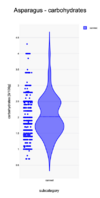
In the second plot the actual datapoints have been added to the side of the violin. One sees that there are a lot of points around 2.5 g/100g. There might have been some rounding off used by the producers to this values, thus overpopulating this value.

