Dashboard/Explanation
Every month a dashboard is created for a select set of countries. The dashboard presents a summary of the data situation for a country. The elements of this summary is presented here.
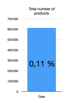
Total number of products
The histogram shows the total number of products for the country in question with the growth on previous month as a percentage.
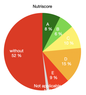
Nutriscore
The pie-chart shows the percentage of products with and without a (calculated) Nutriscore. For the products that have a Nutriscore, the subdivision by score is shown.
Nutritional Values
The calculation of the Nutriscore is based on the availability of a category and the nutritional values. The Nutritional values piechart shows, which percentage of products have this data available. Read this as green is good and red is bad.
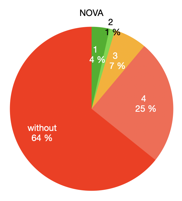
NOVA
The pie-chart shows the percentage of products with and without a (calculated) NOVA. For the products that have a NOVA, the subdivision by score is shown.


