Difference between revisions of "Visualisation/Violinplot"
| Line 5: | Line 5: | ||
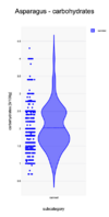
[[File:Violinplot-example-points.png|100 px|thumb|left]] In the second plot the actual datapoints have been added to the side of the violin. One sees that there are a lot of points around 2.5 g/100g. There might have been some rounding off used by the producers to this values, thus overpopulating this value. Note that the tail between 3.5 and 4.5 g/100g only involves some 10 points (2% of the products). | [[File:Violinplot-example-points.png|100 px|thumb|left]] In the second plot the actual datapoints have been added to the side of the violin. One sees that there are a lot of points around 2.5 g/100g. There might have been some rounding off used by the producers to this values, thus overpopulating this value. Note that the tail between 3.5 and 4.5 g/100g only involves some 10 points (2% of the products). | ||
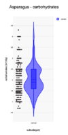
[[File:Violinplot-example-boxplot.png|100 px|thumb|left]]The third plot also shows the corresponding box plot. Note that the media falls below the mean, which is indicative of a skewed distribution. The quartiles go from 1.6 to 2.5 g/100g and are presented as the box. The lower boundary lies at 0.25 g/100g (see the lower whisker). There are products below this boundary. The upper boundary lies at 3.85 g/100g. There are 11 products above the boundary. These products can be checked in further detail to check whether the values correspond to those found on the package. | [[File:Violinplot-example-boxplot.png|100 px|thumb|left]]The third plot also shows the corresponding box plot. Note that the media falls below the mean, which is indicative of a skewed distribution. The quartiles go from 1.6 to 2.5 g/100g and are presented as the box. The lower boundary lies at 0.25 g/100g (see the lower whisker). There are products below this boundary. The upper boundary lies at 3.85 g/100g. There are 11 products above the boundary. These products can be checked in further detail to check whether the values correspond to those found on the package. | ||
| + | This plot is created with [https://www.statskingdom.com/violin-plot-maker.html Stats Kingdom]. | ||
| + | [[Category:Visualisation]] | ||
Latest revision as of 11:46, 1 October 2024
The violin plot is one of the visualisation possibilities for OFF data.
Example
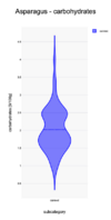
The carbohydrates distribution of products in the category Canned Asparagus are show in plot. 540 products have been used in creating the plot. The carbohydrates values go from 0.3 to above 4.5 g/100g. There seem to be two peaks in the distribution: around 1.7 and 2.5 g/100g. The distribution has a long tail between 3 and 4.5 g/100g. This might indicate an issue with these products: are the values correct? why do these deviate so much from the mean?
In the second plot the actual datapoints have been added to the side of the violin. One sees that there are a lot of points around 2.5 g/100g. There might have been some rounding off used by the producers to this values, thus overpopulating this value. Note that the tail between 3.5 and 4.5 g/100g only involves some 10 points (2% of the products).
The third plot also shows the corresponding box plot. Note that the media falls below the mean, which is indicative of a skewed distribution. The quartiles go from 1.6 to 2.5 g/100g and are presented as the box. The lower boundary lies at 0.25 g/100g (see the lower whisker). There are products below this boundary. The upper boundary lies at 3.85 g/100g. There are 11 products above the boundary. These products can be checked in further detail to check whether the values correspond to those found on the package.
This plot is created with Stats Kingdom.


