Difference between revisions of "Visualisation/Violinplot"
Jump to navigation
Jump to search
| Line 1: | Line 1: | ||
== Example == | == Example == | ||
| + | [[File:Violinplot-example.png|100 px|thumb|right]] | ||
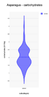
The carbohydrates distribution of products in the category Canned Asparagus are show in plot. The carbohydrates values go from 0.3 to above 4.5 g/100g. There seem to be two peaks in the distribution: around 1.7 and 2.5 g/100g. The distribution has a long tail between 3 and 4.5 g/100g. This might indicate an issue with these products: are the values correct? why do these deviate so much from the mean | The carbohydrates distribution of products in the category Canned Asparagus are show in plot. The carbohydrates values go from 0.3 to above 4.5 g/100g. There seem to be two peaks in the distribution: around 1.7 and 2.5 g/100g. The distribution has a long tail between 3 and 4.5 g/100g. This might indicate an issue with these products: are the values correct? why do these deviate so much from the mean | ||
| − | |||
| − | |||
| − | |||
Revision as of 06:39, 1 October 2024
Example
The carbohydrates distribution of products in the category Canned Asparagus are show in plot. The carbohydrates values go from 0.3 to above 4.5 g/100g. There seem to be two peaks in the distribution: around 1.7 and 2.5 g/100g. The distribution has a long tail between 3 and 4.5 g/100g. This might indicate an issue with these products: are the values correct? why do these deviate so much from the mean
