Difference between revisions of "Nutrients/Energy (expected-ico)"
| (7 intermediate revisions by the same user not shown) | |||
| Line 16: | Line 16: | ||
[[File:CannedAsparagusEnergyComparison.png|200 px|thumb|right|Energy comparison]] | [[File:CannedAsparagusEnergyComparison.png|200 px|thumb|right|Energy comparison]] | ||
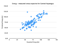
The plot shows the published energy versus the expected energy for the category [https://world.openfoodfacts.org/category/canned-asparagus/ Canned Asparagus]. As expected there is a pretty good relation between the two variables. The line shows the linear fit. There are a few products which lie well off the fit and should be marked as suspicious. | The plot shows the published energy versus the expected energy for the category [https://world.openfoodfacts.org/category/canned-asparagus/ Canned Asparagus]. As expected there is a pretty good relation between the two variables. The line shows the linear fit. There are a few products which lie well off the fit and should be marked as suspicious. | ||
| − | Note that there seem to be two lines, one slightly lower than the other. | + | Note that there seem to be two lines, one slightly lower than the other. This is more clearly visible when one plots the difference between the energies in a violin plot (see below). |
| + | [[File:CannedAsparagusEnergyContributions.png|200 px|thumb|left|Energy Contributions]] | ||
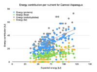
| + | Each nutrient contributes differently to the total energy. The plot shows what each nutrient actually contributes versus the total expected energy. | ||
| + | * Fat contributes up to 20 kJ, which corresponds to about 0.5 g/100g. This is often the upper fat limit of a product. Thus this contributes seems to only add some noise to the total calculation; | ||
| + | * Fiber contributes about 10 kJ to the total energy. The fit seems flat, but should pass through the origin of the plot (0,0). Why?; | ||
| + | * Proteins contribute a fraction that depends on the expected energy; | ||
| + | * Carbohydrates contribute the most to the total energy, which is also a fraction; | ||
| + | [[File:CannedAsparagusEnergyContributionFraction.png|200 px|thumb|right|Fraction]] | ||
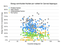
| + | Instead of plotting the actual contribution, we can plot the fraction of energy that each nutrient contributes. Note that the scatter for all nutrients is very large. | ||
| + | * Fat contributes between 5% and 25%. Seems there is an issue with fat percentages reported on products. Should this be excluded from the contributions?; | ||
| + | * Fiber contributes between 20% and 10%; | ||
| + | * Proteins contribute 40%; | ||
| + | * Carbohydrates contribute some 50%; | ||
| + | == Orange Juice == | ||
| + | [[File:OrangeJuiceEnergyComparison.png|200 px|thumb|left|Comparison]] | ||
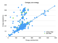
| + | The graph shows a comparison between published energy and expected energies, which are calculated from the nutrients. There is a good relationship, but there are a lot of outliers, which indicate an issue with the data. Probably these outliers are due to US products, which are not normalised to 100 mL. | ||
| + | [[File:OrangeJuiceEnergyContribution.png|200 px|thumb|right|Energy Contribution]] | ||
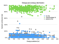
| + | The plot on the right shows which nutrient contributes to the overall energy of a product. For orange juices most of the energy comes from the carbohydrates (90%). The rest of the energy seems to come from fat, but the actual value is not clear. Most of the fat values are indicated as limits (< 0.5%). There seem to be a lot of outliers, which warrant closer inspection. | ||
= Data quality = | = Data quality = | ||
The expected energy can be compared to published energy. If the two deviate too much, there will be an error in the ingredients. But what is too much? What boundaries should be used to claim this? Again some practical information is needed for various categories. | The expected energy can be compared to published energy. If the two deviate too much, there will be an error in the ingredients. But what is too much? What boundaries should be used to claim this? Again some practical information is needed for various categories. | ||
| − | == Canned Asparagus deviations == | + | === Canned Asparagus deviations === |
[[File:Canned-asparagus-deviations.png.png|100 px|thumb|right]] | [[File:Canned-asparagus-deviations.png.png|100 px|thumb|right]] | ||
The image shows the difference the expected and published energies for the category Canned Asparagus. Only the products that have published fiber are included. The distribution is indeed around the expected zero with quartiles around ±10 kJ. There seem to be two groups: one around +10kJ and one around -8kJ. The spread seems very large (±20 kJ) for a product that is on average 75kJ. This implies that a boundary of ±30% is appropriate for this category, otherwise to many false positives will be tagged. | The image shows the difference the expected and published energies for the category Canned Asparagus. Only the products that have published fiber are included. The distribution is indeed around the expected zero with quartiles around ±10 kJ. There seem to be two groups: one around +10kJ and one around -8kJ. The spread seems very large (±20 kJ) for a product that is on average 75kJ. This implies that a boundary of ±30% is appropriate for this category, otherwise to many false positives will be tagged. | ||
| + | === Orange juice deviations === | ||
| + | [[File:OrangeJuiceDeviations.png|100 px|thumb|left|Deviations]]The plot on the left shows the differences between published energy and calculated energy. In the graph the outliers have been removed. The deviation is ±15%, which can be used as a trigger level for quality. | ||
| + | [[Category:Quality]] | ||
| + | [[Category:Data quality]] | ||
Latest revision as of 07:34, 5 October 2024
The energy of a product is caused/produced by one or more of its ingredients, mainly fat, carbohydrates, proteins and fibre. The relation between the energy and these nutrients is straightforward and allows us to predict the energy from these nutrients. This gives us a check on the published energy of a product.
Formula
The official formula published by the EU (ICOAnnex 5) is: Energy = ((carbohydrates - polyols)*17) + (polyols * 10) + (proteins * 17) + (fat * 37) + (fiber * 8) + (alcohol * 29) With
- Energy in kJoule;
- carbohydrates in g/100g;
- polyols - the polyols which are counted as carbohydrates, but contribute less on g/100g
- proteins in g/100g;
- fat in g/100g;
- fiber in g/100g;
- alcohol in %Vol;
Examples
For specific simple categories the relation (fractions) between the nutrients is probably fixed. Thus each nutrient will contribute a certain percentage.
Canned Asparagus
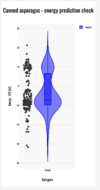
The plot shows the published energy versus the expected energy for the category Canned Asparagus. As expected there is a pretty good relation between the two variables. The line shows the linear fit. There are a few products which lie well off the fit and should be marked as suspicious. Note that there seem to be two lines, one slightly lower than the other. This is more clearly visible when one plots the difference between the energies in a violin plot (see below).
Each nutrient contributes differently to the total energy. The plot shows what each nutrient actually contributes versus the total expected energy.
- Fat contributes up to 20 kJ, which corresponds to about 0.5 g/100g. This is often the upper fat limit of a product. Thus this contributes seems to only add some noise to the total calculation;
- Fiber contributes about 10 kJ to the total energy. The fit seems flat, but should pass through the origin of the plot (0,0). Why?;
- Proteins contribute a fraction that depends on the expected energy;
- Carbohydrates contribute the most to the total energy, which is also a fraction;
Instead of plotting the actual contribution, we can plot the fraction of energy that each nutrient contributes. Note that the scatter for all nutrients is very large.
- Fat contributes between 5% and 25%. Seems there is an issue with fat percentages reported on products. Should this be excluded from the contributions?;
- Fiber contributes between 20% and 10%;
- Proteins contribute 40%;
- Carbohydrates contribute some 50%;
Orange Juice
The graph shows a comparison between published energy and expected energies, which are calculated from the nutrients. There is a good relationship, but there are a lot of outliers, which indicate an issue with the data. Probably these outliers are due to US products, which are not normalised to 100 mL.
The plot on the right shows which nutrient contributes to the overall energy of a product. For orange juices most of the energy comes from the carbohydrates (90%). The rest of the energy seems to come from fat, but the actual value is not clear. Most of the fat values are indicated as limits (< 0.5%). There seem to be a lot of outliers, which warrant closer inspection.
Data quality
The expected energy can be compared to published energy. If the two deviate too much, there will be an error in the ingredients. But what is too much? What boundaries should be used to claim this? Again some practical information is needed for various categories.
Canned Asparagus deviations
The image shows the difference the expected and published energies for the category Canned Asparagus. Only the products that have published fiber are included. The distribution is indeed around the expected zero with quartiles around ±10 kJ. There seem to be two groups: one around +10kJ and one around -8kJ. The spread seems very large (±20 kJ) for a product that is on average 75kJ. This implies that a boundary of ±30% is appropriate for this category, otherwise to many false positives will be tagged.
Orange juice deviations
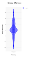
The plot on the left shows the differences between published energy and calculated energy. In the graph the outliers have been removed. The deviation is ±15%, which can be used as a trigger level for quality.
