Difference between revisions of "Visualisation/Boxplot"
| Line 7: | Line 7: | ||
== Example == | == Example == | ||
[[File:Boxplot-example.png|200 px|thumb|right]] | [[File:Boxplot-example.png|200 px|thumb|right]] | ||
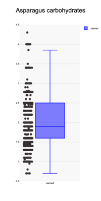
| − | The plot shows an example of a box plot with jittered datapoints. The data is based on 540 Canned Asparagus products and the carbohydrates value for these products is shown. The box represents the interquartiles range and thus describes 50% of the products. The lower whisker shows the minimum of the data and the upper whisker show the boundary based on a 1.5 Tukey factor. | + | The plot shows an example of a box plot with jittered datapoints. The data is based on 540 [https://world.openfoodfacts.org/category/canned-asparagus Canned Asparagus] products and the carbohydrates value for these products is shown. The box represents the interquartiles range and thus describes 50% of the products. The lower whisker shows the minimum of the data and the upper whisker show the boundary based on a 1.5 Tukey factor. |
This plot is created with [https://www.statskingdom.com/advanced-boxplot-maker.html Stats Kingdom]. | This plot is created with [https://www.statskingdom.com/advanced-boxplot-maker.html Stats Kingdom]. | ||
[[Category:Visualisation]] | [[Category:Visualisation]] | ||
Revision as of 08:43, 1 October 2024
The box plot is one of the visualisation possibilities for OFF data. The box plot summarises the statistics of the distribution of a variable (nutrient). This graph is especially suited for non-normal (non-gaussian) distributions. A typical bixplot contains the median, the mean, the quartiles, minimum/maximum and limits (lower/upper) of the distribution. Usually the X-axis lists one or more product sets, for instance products in a specific category. And the Y-axis shows the statistical parameters. The interquartile distance is drawn as a box. The limits as lines blow and above the box (the whiskers).
Enhancements
- It is advised to add the data to the box plot. Viewing the data might give some weight to the statistics. Otherwise one can not distinguish between boxplots with few data and a lot of data. As there is no horizontal scale, the datapoints are jittered randomly around the central line.
- If needed the plot can be expanded with the mean and standard deviation.
- Combining this box plot with a violin plot gives more insight about the actual distribution.
Example
The plot shows an example of a box plot with jittered datapoints. The data is based on 540 Canned Asparagus products and the carbohydrates value for these products is shown. The box represents the interquartiles range and thus describes 50% of the products. The lower whisker shows the minimum of the data and the upper whisker show the boundary based on a 1.5 Tukey factor. This plot is created with Stats Kingdom.
